Design Beautiful AI/BI Dashboards People Actually Read
A calm, engineer-to-engineer walkthrough of dashboard themes, layout, and the small design habits that make Databricks AI/BI dashboards feel trustworthy.
Most dashboards do not fail because the SQL is wrong.
They fail because nobody wants to look at them.
Databricks recently shared how their team designs AI/BI dashboards, and the ideas travel well beyond one product. This is the calm version of that guide, written for data engineers and analysts who want their work to actually get used.
Why dashboard design matters more than we admit
A dashboard is the last mile of your pipeline. You cleaned the data, you modeled it, you governed it in Unity Catalog. Then you handed it to a chart, and the chart is what your CFO remembers.
If it looks messy, they trust it less. If it looks calm, they trust it more. That is not vanity. That is how decisions get made.
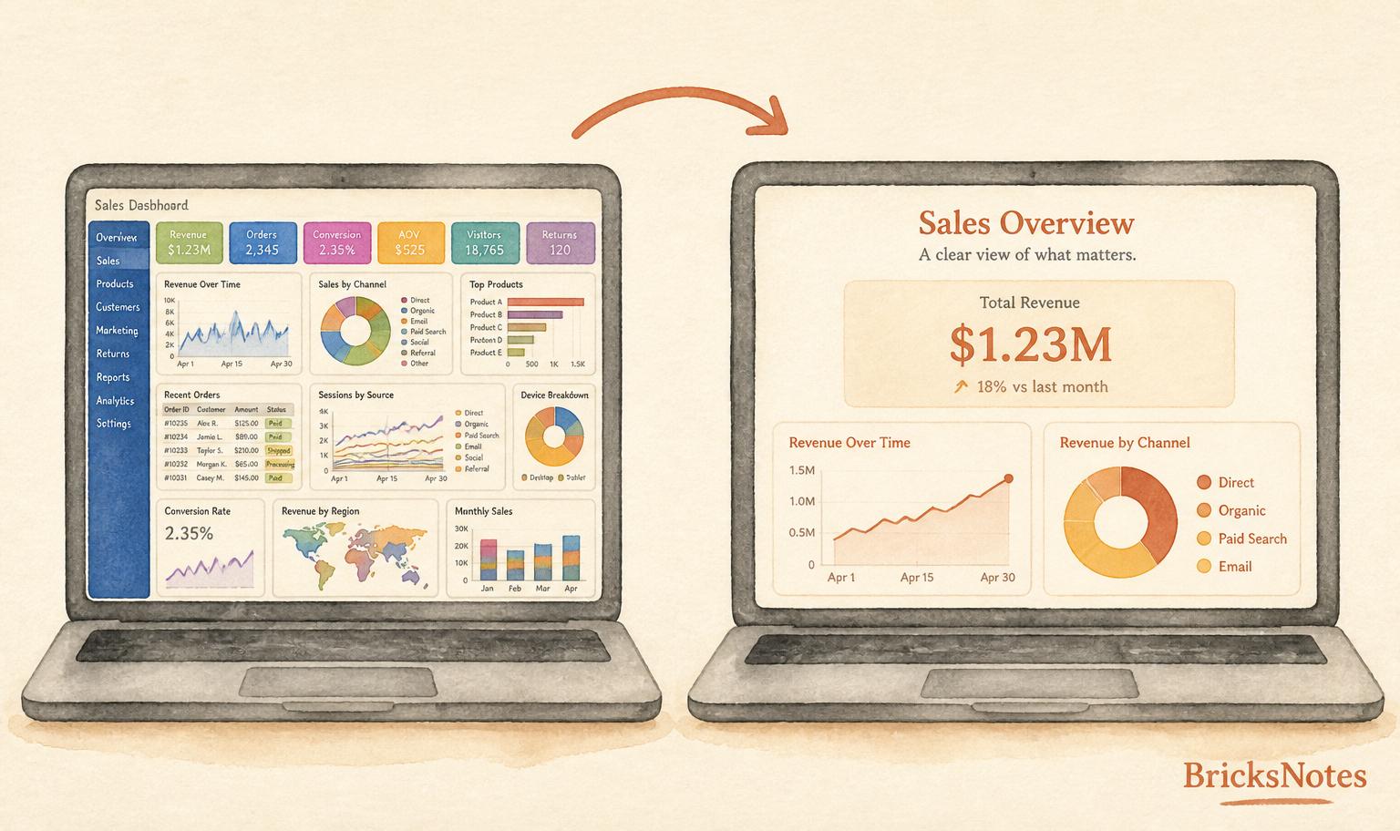
The left one is not wrong. It is just tired. Ten colors, three fonts, and a KPI row that reads like a receipt. The right one says the same thing with less noise, and the reader gets the point in two seconds.
Start with a theme, not a chart
The first move in a Databricks AI/BI dashboard is not picking a visualization. It is picking a theme.
Themes control fonts, colors, and the visualization palette in one place. When you set them once, every chart on the dashboard inherits them. When your company sets a workspace theme, every new dashboard inherits it too. That single decision removes an hour of fiddling per dashboard and stops the slow drift where every author picks a slightly different blue.
A useful rule: pick two accent colors and one neutral. Use the accents to draw the eye to what matters. Use the neutral for everything else. If a chart needs a third color to make sense, it usually needs a rethink, not a color.
Design for the person reading it
Ask one honest question before you start dragging widgets.
Who is this for, and what decision are they trying to make?
An executive scanning on a phone at 7 a.m. wants one number and a trend. An operations lead wants a table they can filter. A data engineer wants freshness, row counts, and a link to the pipeline. Same source of truth, three different dashboards.
If you try to serve all three on one page, you serve none of them well.
A layout that actually works
You do not need a design degree for this. You need a grid and some restraint.
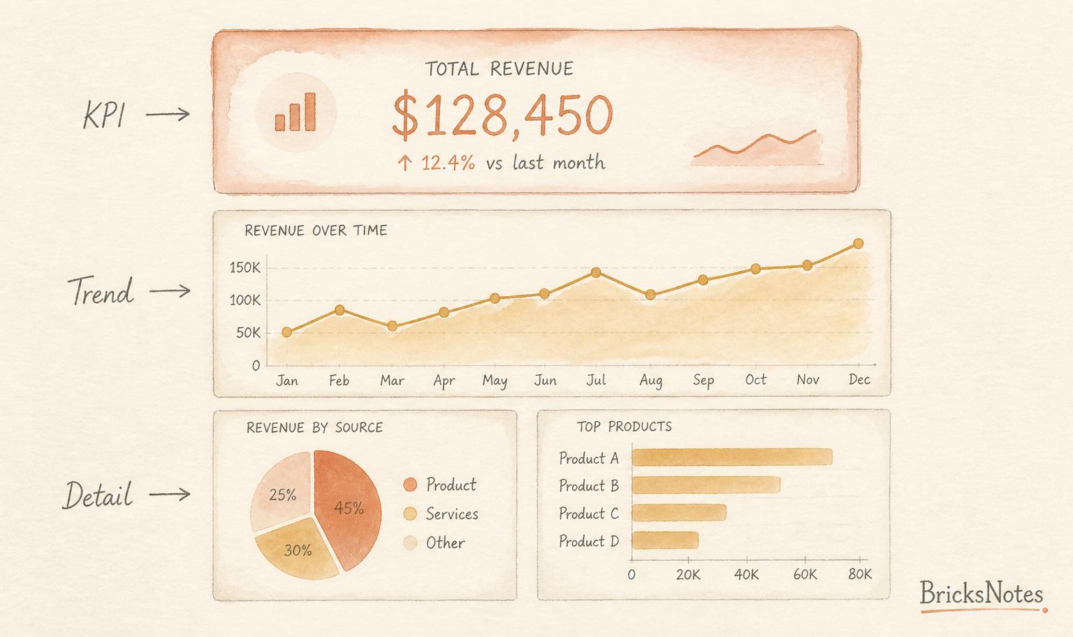
Top row: the answer. One or two big KPIs. Nothing else competes.
Middle row: the trend. One clear line or bar chart that shows how the KPI is moving.
Bottom row: the detail. Two or three supporting charts for the people who want to dig in.
Read top to bottom, left to right. That is how English readers scan. Fight the grid and you fight your reader.
Small habits that raise the quality bar
None of these are hard. All of them are skipped.
Write a real title. Not "Sales". Try "Sales are up 12 percent this quarter, driven by direct channel." A title that states the finding turns a chart into a sentence.
Round your numbers. $1,234,567 is a number. $1.23M is a number a human can hold. Save the decimals for the tooltip.
Label your axes in words. "USD, monthly" beats a bare number every time.
Kill the second decimal in percentages. 12.4 percent is enough. 12.42 percent is a false promise.
Use color to mean something. If red means bad and green means good on one chart, do not use red for a category name on the next one. Consistency is a design system.
Add one line of context. "Data refreshed 6 a.m. UTC" or "Excludes returns" saves you three Slack messages.
Data quality is a design choice
A beautiful dashboard on bad data is a lie in a nice font.
Before you polish, check the boring things. Freshness. Null counts. Row counts against the source. If your gold table is off by one late arrival, your dashboard is off by one late arrival, and the CFO will remember that longer than any color palette.
We wrote more about this mindset in data quality as a design constraint and how the medallion architecture protects your dashboards. Both are worth a slow read before the next dashboard review.
Governance is what makes it scale
Themes only work if everyone can find them. Palettes only work if nobody overrides them. That is a Unity Catalog conversation, not a design conversation.
If your workspace has one theme, one canonical color scale, and one place to file "please add a color for on-time delivery," your dashboards start looking like they come from the same company. If not, every team invents its own blue and every review meeting starts with a debate about the axis.
For the wider story on how governance quietly enables good design, see Unity Catalog and the deeper piece on Your AI is Ready. Is Your Data Foundation?
A short checklist before you ship
Before you send the link, read the dashboard as if you had never seen it.
- Can I state the finding in one sentence?
- Is the most important number the biggest thing on the page?
- Would a phone screen still show the top KPI?
- Are the colors doing work, or are they just there?
- Is there a freshness stamp somewhere visible?
- Would I trust this if a stranger sent it to me?
If any answer is no, spend fifteen more minutes. That is usually all it takes.
Continue learning
- BI integration for how dashboards plug into the wider stack
- Visual data prep for cleaner inputs that make cleaner charts
- Unity Catalog for the governance spine under every good dashboard
- Data quality for the checks that keep dashboards honest
- Agent Bricks is GA. Here's How to Ship an Agent Without Regret. for what happens after the dashboard becomes an agent
- Free datasets if you want a small, clean table to practice a redesign this week
Design is not extra work. It is the work that makes the rest of the work count.